TeleMedicine: Healthcare made Easier, Faster, and Safer
Industry
Healthcare
Platform
Website
Project type
CaseStudy
Role
Lead UI/UX Designer
Tools
Figma, Notion, Paper and Pen,Microsoft word
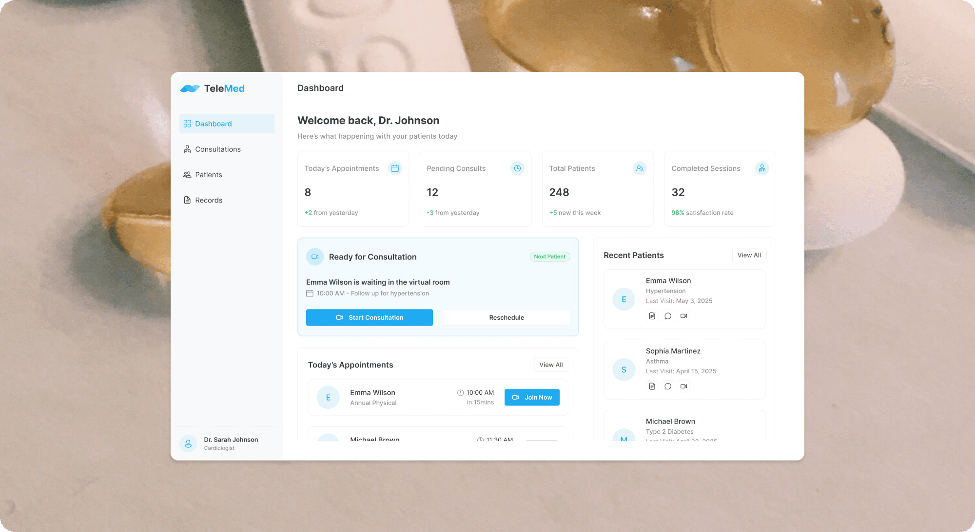
Designing for Access: The Why Behind TeleMed
Visiting a doctor should be simple—but for many people, it isn’t. Long travel times, crowded waiting rooms, limited access to specialists, or just needing a quick answer for something minor—these are everyday challenges in healthcare.
That’s what led to the creation of TeleMed, a solution designed to make healthcare easier, faster, and safer for everyone.
This case study explores how TeleMedicine was introduced to solve four key problems:
People in rural or remote areas who struggle to access care.
Patients trying to avoid hospital environments, especially after COVID-19.
Overwhelmed doctors with packed schedules and limited time.
Individuals who just need quick medical advice without the stress of a full appointment.
This project was designed with the goal of improving the patient experience—making it more accessible, intuitive, and human-centered. I’ll walk through the research, design thinking, and user-centric decisions that shaped this telehealth experience.

🩺 Understanding the Problem
Despite advances in medical technology, access to quality healthcare remains a global challenge. Many patients—especially those in rural areas or with mobility issues—still struggle to get the care they need. Even in urban settings, overcrowded clinics, long wait times, and high costs make in-person doctor visits inefficient for both patients and medical professionals.
The goal with this project is to reimagine how patients and doctors connect—by removing the barriers of distance, time, and unnecessary costs.
🎯 Problem Statement
How might we create a seamless, digital-first experience that gives patients faster access to care—while making doctors more efficient and reducing the burden on healthcare facilities?
🔍 Research & Insights
Despite advances in medical technology, access to quality healthcare remains a global challenge. Many patients—especially those in rural areas or with mobility issues—still struggle to get the care they need. Even in urban settings, overcrowded clinics, long wait times, and high costs make in-person doctor visits inefficient for both patients and medical professionals.
The goal with this project is to reimagine how patients and doctors connect—by removing the barriers of distance, time, and unnecessary costs.
Results & Key Takeaways
After several design iterations and usability testing, 75% of users found Peoply easy and intuitive to use. Tasks like leave approvals, payroll processing, and employee management became smoother and faster for small businesses.
Peoply’s simple, user-centered design helped small teams cut down on administrative burdens and focus more on growing their businesses.
Key Takeaways:
Building for simplicity makes a bigger impact than adding complex features.
Early usability testing was crucial to shaping a user-friendly experience.
Real empathy for small teams created a tool that truly fit their everyday needs.