

1st Place @ CHIA Website
1st Place @ CHIA Website
1st Place @ CHIA Website
Solo-designed Uppsala HCI's first official website and won.
Solo-designed Uppsala HCI's first official website and won.
Industry:
University Student Association
Platform:
Website
Role:
UI/UX Designer
Tools:
Figma, Framer, FigJam
Overview
CHIA, the Computer-Human Interaction Association, is the student association for Uppsala University's Human-Computer Interaction master's program. The association had never had an official website, so it ran a website design competition open to students in and out of the program to change that. Every participant started from the same brief: CHIA's brand guidelines, plus a document outlining the pages the site needed to include. I entered solo and placed first, a win announced on CHIA's Instagram page. The competition ran for three weeks with entries judged by CHIA's board members, who gave strong feedback: the design fit the vibe they were going for, stayed true to the brand guide, and came across as professional.
CHIA, the Computer-Human Interaction Association, is the student association for Uppsala University's Human-Computer Interaction master's program. The association had never had an official website, so it ran a website design competition open to students in and out of the program to change that. Every participant started from the same brief: CHIA's brand guidelines, plus a document outlining the pages the site needed to include. I entered solo and placed first, a win announced on CHIA's Instagram page. The competition ran for three weeks with entries judged by CHIA's board members, who gave strong feedback: the design fit the vibe they were going for, stayed true to the brand guide, and came across as professional.
CHIA, the Computer-Human Interaction Association, is the student association for Uppsala University's Human-Computer Interaction master's program. The association had never had an official website, so it ran a website design competition open to students in and out of the program to change that. Every participant started from the same brief: CHIA's brand guidelines, plus a document outlining the pages the site needed to include. I entered solo and placed first, a win announced on CHIA's Instagram page. The competition ran for three weeks with entries judged by CHIA's board members, who gave strong feedback: the design fit the vibe they were going for, stayed true to the brand guide, and came across as professional.


The Goal
The Goal
The Goal
"CHIA needed a website that gave it a professional, credible presence, and a central place to share information about the association, its events, and meeting protocols. The site had to work for a mix of audiences: prospective and current HCI students, visitors curious about the association, and outside organizations interested in collaborating on events."
"CHIA needed a website that gave it a professional, credible presence, and a central place to share information about the association, its events, and meeting protocols. The site had to work for a mix of audiences: prospective and current HCI students, visitors curious about the association, and outside organizations interested in collaborating on events."
"CHIA needed a website that gave it a professional, credible presence, and a central place to share information about the association, its events, and meeting protocols. The site had to work for a mix of audiences: prospective and current HCI students, visitors curious about the association, and outside organizations interested in collaborating on events."
Getting Started
Getting Started
Getting Started
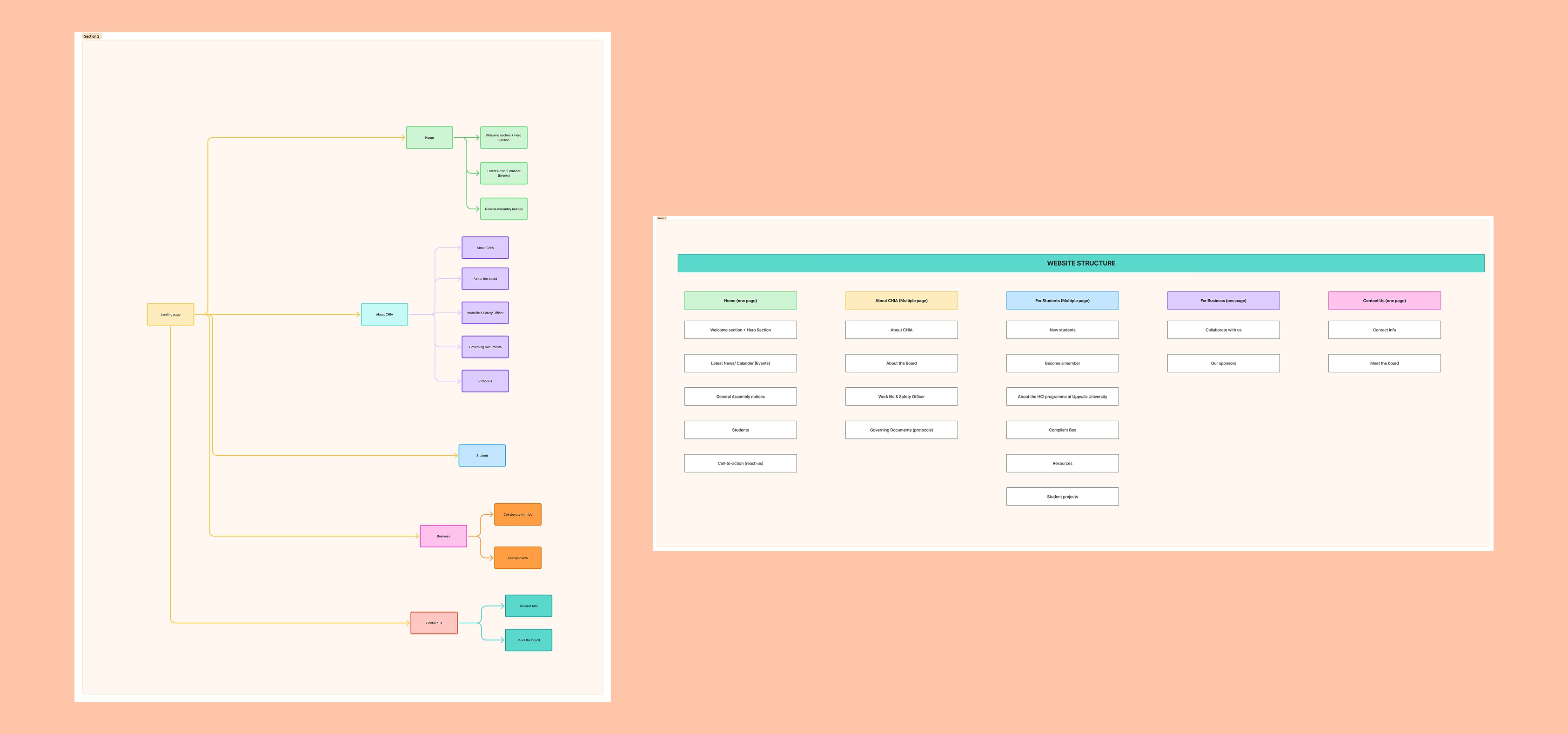
Being an HCI student myself gave me a head start on understanding what CHIA was about, but I still took the time to really dig into the association before starting to design. I began with mapping out a navigation menu to pin down exactly which pages were needed and what content belonged on each one. From there, I built a user flow to map how someone would actually move through the site from start to finish.
Being an HCI student myself gave me a head start on understanding what CHIA was about, but I still took the time to really dig into the association before starting to design. I began with mapping out a navigation menu to pin down exactly which pages were needed and what content belonged on each one. From there, I built a user flow to map how someone would actually move through the site from start to finish.
Being an HCI student myself gave me a head start on understanding what CHIA was about, but I still took the time to really dig into the association before starting to design. I began with mapping out a navigation menu to pin down exactly which pages were needed and what content belonged on each one. From there, I built a user flow to map how someone would actually move through the site from start to finish.
Balancing the Brand
Balancing the Brand
Balancing the Brand
CHIA's brand guide was playful, full of fun shapes, bold colors, and expressive typography. That turned out to be the project's biggest challenge. When I looked at other student association websites for reference, most leaned formal and understated by comparison. The real test was bringing CHIA's playful identity into a website that still felt credible and appropriately serious for a university association.
CHIA's brand guide was playful, full of fun shapes, bold colors, and expressive typography. That turned out to be the project's biggest challenge. When I looked at other student association websites for reference, most leaned formal and understated by comparison. The real test was bringing CHIA's playful identity into a website that still felt credible and appropriately serious for a university association.
CHIA's brand guide was playful, full of fun shapes, bold colors, and expressive typography. That turned out to be the project's biggest challenge. When I looked at other student association websites for reference, most leaned formal and understated by comparison. The real test was bringing CHIA's playful identity into a website that still felt credible and appropriately serious for a university association.

Final Design
Final Design
Final Design
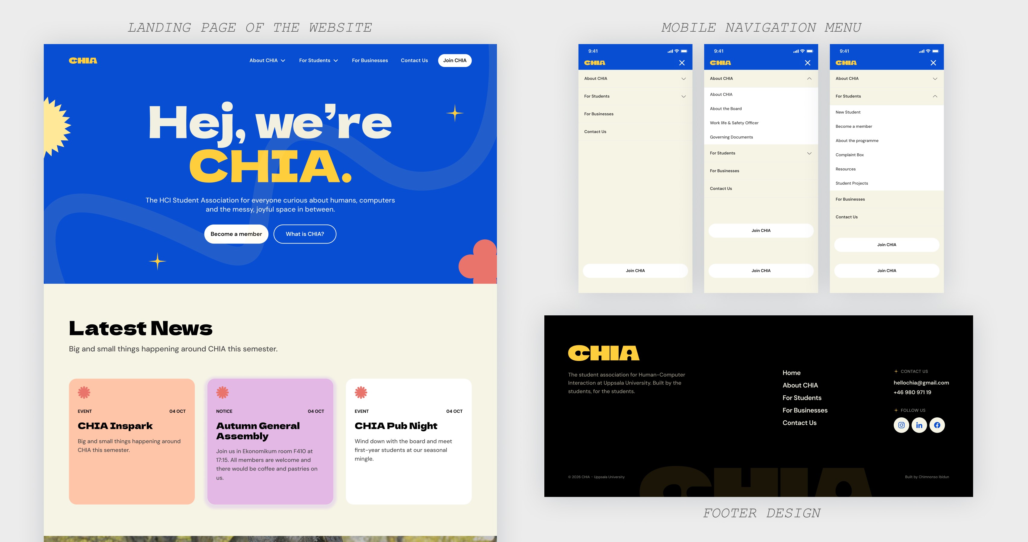
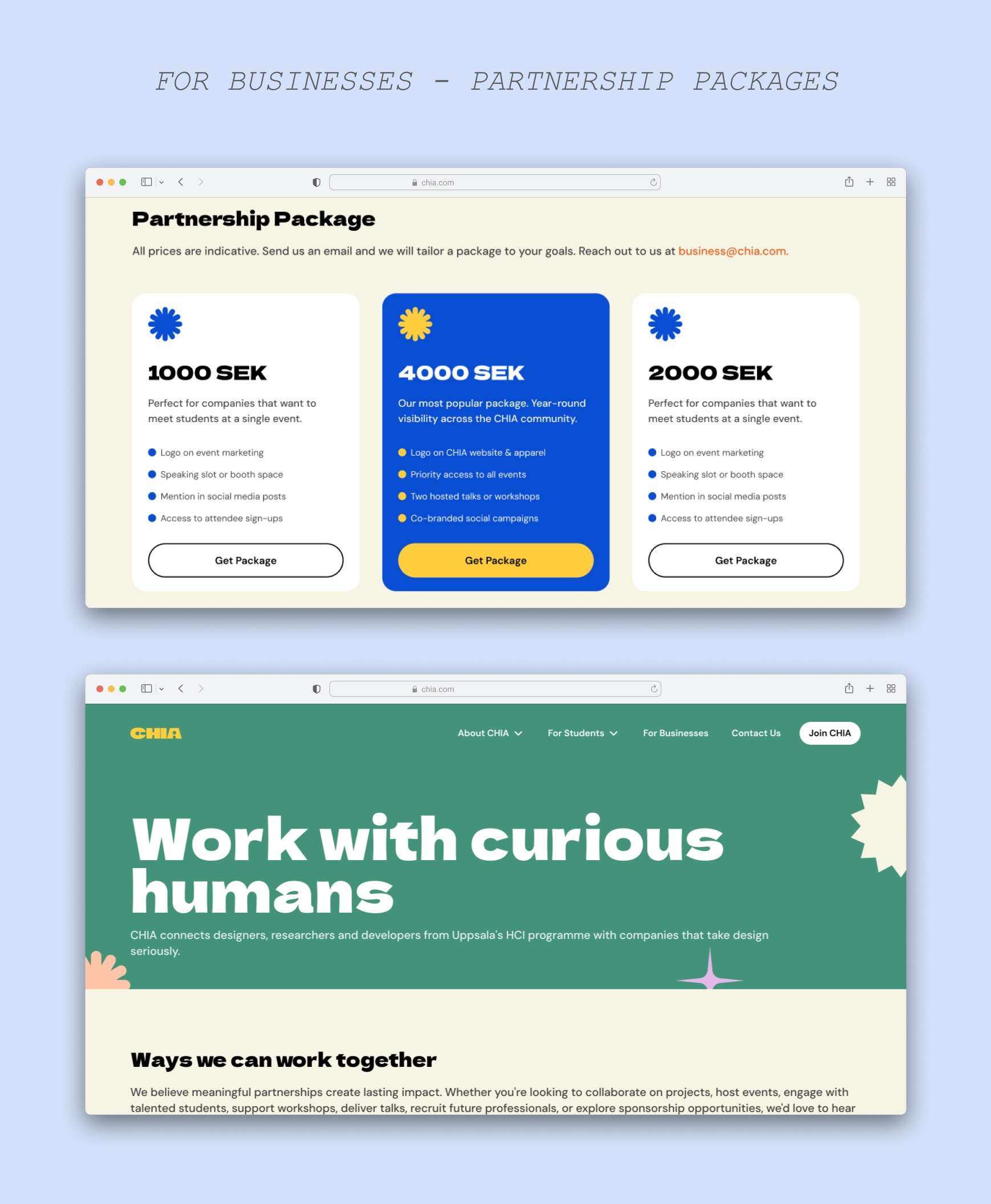
The final design was made on Figma, built on the navigation structure and user flow from early on, and stayed true to the fonts, colors, and assets in CHIA's brand guide. It was later developed into the live site using Framer.
The final design was made on Figma, built on the navigation structure and user flow from early on, and stayed true to the fonts, colors, and assets in CHIA's brand guide. It was later developed into the live site using Framer.
The final design was made on Figma, built on the navigation structure and user flow from early on, and stayed true to the fonts, colors, and assets in CHIA's brand guide. It was later developed into the live site using Framer.


UP NEXT…
Get in touch
Glad we could cross paths. I hope it left you with
a bit of curiosity and inspiration.
© Chimnonso Ibidun, 2026
Designed intentionally by Chimnonso ✨
Get in touch
Glad we could cross paths. I hope it left you with a bit of curiosity and inspiration.
© Chimnonso Ibidun, 2026
Designed intentionally by Chimnonso ✨