

The Remita Makeover
The Remita Makeover
The Remita Makeover
Remita Rebranding Journey for the Future of Finance
Industry:
Fintech, Payments, Finance
Platform:
Website
Role:
UI/UX Designer (with 7 designers, 3 product managers, 8+ engineers)
Tools:
Figma, Miro, Paper and Pen, Photoshop, Illustrator, Trello, Microsoft Word, Draw.io, Teams
Overview
Remita, a leading Nigerian electronic payment platform, has been simplifying payments for individuals, businesses, and governments for years. However, as its user base grew and diversified, the existing platform struggled to accommodate the emerging use cases and industry demands. The outdated website design and noticeable UX challenges further highlighted the need for a transformation. In 2024, my team embarked on a mission to redesign Remita’s platform, creating a modern, user-friendly experience that caters seamlessly to all users.
Remita, a leading Nigerian electronic payment platform, has been simplifying payments for individuals, businesses, and governments for years. However, as its user base grew and diversified, the existing platform struggled to accommodate the emerging use cases and industry demands. The outdated website design and noticeable UX challenges further highlighted the need for a transformation. In 2024, my team embarked on a mission to redesign Remita’s platform, creating a modern, user-friendly experience that caters seamlessly to all users.
Remita, a leading Nigerian electronic payment platform, has been simplifying payments for individuals, businesses, and governments for years. However, as its user base grew and diversified, the existing platform struggled to accommodate the emerging use cases and industry demands. The outdated website design and noticeable UX challenges further highlighted the need for a transformation. In 2024, my team embarked on a mission to redesign Remita’s platform, creating a modern, user-friendly experience that caters seamlessly to all users.
What Was the BIG Problem With an Already Established Brand?
What Was the BIG Problem With an Already Established Brand?
What Was the BIG Problem With an Already Established Brand?
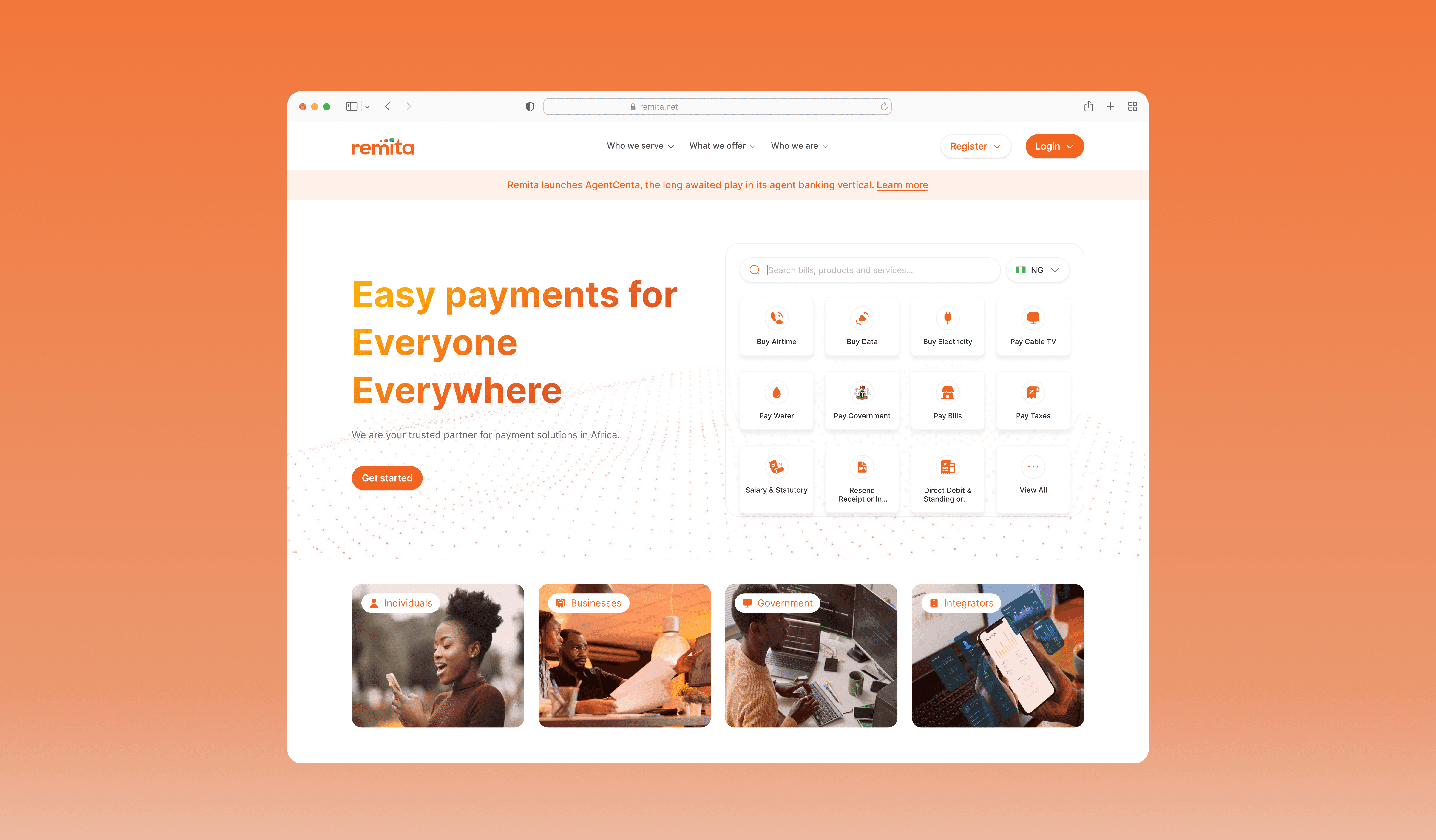
The Remita website was originally designed as a simple payment touchpoint, with limited company and product information. As user needs evolved, several issues became evident: customers struggled to find help when needed, the interface lacked appeal, and the overall user experience was hindered by poor navigation and slow load times.
The Remita website was originally designed as a simple payment touchpoint, with limited company and product information. As user needs evolved, several issues became evident: customers struggled to find help when needed, the interface lacked appeal, and the overall user experience was hindered by poor navigation and slow load times.
The Remita website was originally designed as a simple payment touchpoint, with limited company and product information. As user needs evolved, several issues became evident: customers struggled to find help when needed, the interface lacked appeal, and the overall user experience was hindered by poor navigation and slow load times.
"How might we transform the Remita website into an engaging, intuitive platform that effectively communicates our offerings, provides seamless support, and delivers a delightful experience for all users? "
"How might we transform the Remita website into an engaging, intuitive platform that effectively communicates our offerings, provides seamless support, and delivers a delightful experience for all users? "
"How might we transform the Remita website into an engaging, intuitive platform that effectively communicates our offerings, provides seamless support, and delivers a delightful experience for all users? "
Getting Started
Getting Started
Getting Started
How was this solved in simple bits
How was this solved in simple bits
How was this solved in simple bits
Solution #1: Navigation Framework
Solution #1: Navigation Framework
Solution #1: Navigation Framework
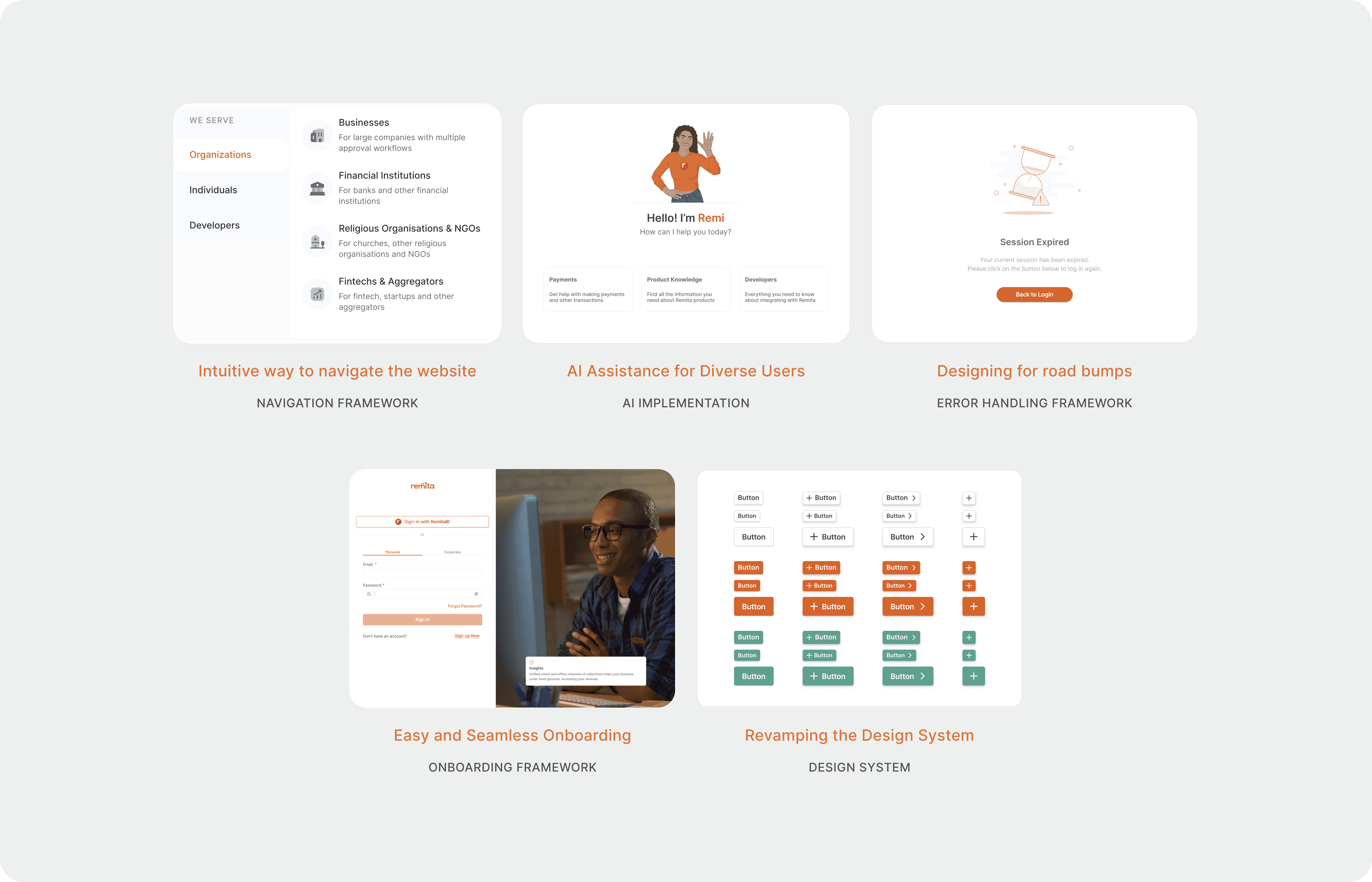
The current Remita website faced challenges with its navigation, making it difficult for users to easily explore its services and offerings. The navigation menu lacked clear organization, leaving many features underrepresented or hard to find.
Recognizing this, the team embarked on a carefully planned redesign of the navigation structure. This redesign was crafted with a deep understanding of the platform's diverse users, the services it provides, and the infrastructures offered.
The new navigation menu introduces a clear and thoughtful categorization:
Who We Serve: Highlighting the specific audiences and user groups we cater to.
What We Offer: Showcasing our full range of products and services.
Who We Are: Sharing insights about Remita's mission, values, and identity.
This restructured navigation ensures that every user can easily find the information they need, creating a seamless experience that reflects the breadth and depth of what Remita has to offer.
The current Remita website faced challenges with its navigation, making it difficult for users to easily explore its services and offerings. The navigation menu lacked clear organization, leaving many features underrepresented or hard to find.
Recognizing this, the team embarked on a carefully planned redesign of the navigation structure. This redesign was crafted with a deep understanding of the platform's diverse users, the services it provides, and the infrastructures offered.
The new navigation menu introduces a clear and thoughtful categorization:
Who We Serve: Highlighting the specific audiences and user groups we cater to.
What We Offer: Showcasing our full range of products and services.
Who We Are: Sharing insights about Remita's mission, values, and identity.
This restructured navigation ensures that every user can easily find the information they need, creating a seamless experience that reflects the breadth and depth of what Remita has to offer.
The current Remita website faced challenges with its navigation, making it difficult for users to easily explore its services and offerings. The navigation menu lacked clear organization, leaving many features underrepresented or hard to find.
Recognizing this, the team embarked on a carefully planned redesign of the navigation structure. This redesign was crafted with a deep understanding of the platform's diverse users, the services it provides, and the infrastructures offered.
The new navigation menu introduces a clear and thoughtful categorization:
Who We Serve: Highlighting the specific audiences and user groups we cater to.
What We Offer: Showcasing our full range of products and services.
Who We Are: Sharing insights about Remita's mission, values, and identity.
This restructured navigation ensures that every user can easily find the information they need, creating a seamless experience that reflects the breadth and depth of what Remita has to offer.

Solution #2: Easy and Seamless Onboarding
Solution #2: Easy and Seamless Onboarding
Solution #2: Easy and Seamless Onboarding
The original onboarding process for Remita products was often lengthy and repetitive, creating unnecessary friction for users—especially those who already had an existing Remita account but needed to sign up for additional services. Recognizing this pain point, the design team collaborated with the product manager to rethink and streamline the entire signup journey. The goal was to reduce complexity while maintaining security, ensuring users could access Remita’s services faster and with less frustration.
The original onboarding process for Remita products was often lengthy and repetitive, creating unnecessary friction for users—especially those who already had an existing Remita account but needed to sign up for additional services. Recognizing this pain point, the design team collaborated with the product manager to rethink and streamline the entire signup journey. The goal was to reduce complexity while maintaining security, ensuring users could access Remita’s services faster and with less frustration.

A key solution introduced was the "Sign Up with Remita" feature, which allowed existing users to skip redundant KYC verification when registering for new Remita products. Instead of re-entering the same details repeatedly, users could simply authenticate with their existing account, significantly cutting down onboarding time. Additionally, we implemented a unified login system, enabling users to access all their Remita products with a single set of credentials—no more managing multiple logins for different services.
A key solution introduced was the "Sign Up with Remita" feature, which allowed existing users to skip redundant KYC verification when registering for new Remita products. Instead of re-entering the same details repeatedly, users could simply authenticate with their existing account, significantly cutting down onboarding time. Additionally, we implemented a unified login system, enabling users to access all their Remita products with a single set of credentials—no more managing multiple logins for different services.

Solution #3: AI Assistance for Diverse Users
Solution #3: AI Assistance for Diverse Users
Solution #3: AI Assistance for Diverse Users
As part of the website redesign, we identified a recurring challenge: users frequently contacted customer support for help with navigating the site or accessing basic information. To address this, we introduced Remi by Remita, a self-service AI chatbot designed to assist users with real-time guidance. Remi helps users complete tasks like making payments or retrieving receipts without needing to contact support, ultimately improving user autonomy and reducing the volume of support requests. This solution ensures a more inclusive and accessible experience for a wide range of users.
As part of the website redesign, we identified a recurring challenge: users frequently contacted customer support for help with navigating the site or accessing basic information. To address this, we introduced Remi by Remita, a self-service AI chatbot designed to assist users with real-time guidance. Remi helps users complete tasks like making payments or retrieving receipts without needing to contact support, ultimately improving user autonomy and reducing the volume of support requests. This solution ensures a more inclusive and accessible experience for a wide range of users.
As part of the website redesign, we identified a recurring challenge: users frequently contacted customer support for help with navigating the site or accessing basic information. To address this, we introduced Remi by Remita, a self-service AI chatbot designed to assist users with real-time guidance. Remi helps users complete tasks like making payments or retrieving receipts without needing to contact support, ultimately improving user autonomy and reducing the volume of support requests. This solution ensures a more inclusive and accessible experience for a wide range of users.

Solution #4: Implementing a New Brand Guide and Design System
Solution #4: Implementing a New Brand Guide and Design System
Solution #4: Implementing a New Brand Guide and Design System
In 2024, the Remita design team created a new design system to modernize the brand’s look and ensure consistency across all products. With this new foundation in place, the team turned to one of the company’s most visible touchpoints, the website. Having remained unchanged since 2018, the old site lacked both aesthetic appeal and functional clarity, often failing to communicate the breadth of Remita’s offerings. Leveraging the newly built design system, the team redesigned the website into a modern, intuitive, and visually engaging platform that clearly reflects Remita’s value and evolution.
In 2024, the Remita design team created a new design system to modernize the brand’s look and ensure consistency across all products. With this new foundation in place, the team turned to one of the company’s most visible touchpoints, the website. Having remained unchanged since 2018, the old site lacked both aesthetic appeal and functional clarity, often failing to communicate the breadth of Remita’s offerings. Leveraging the newly built design system, the team redesigned the website into a modern, intuitive, and visually engaging platform that clearly reflects Remita’s value and evolution.
In 2024, the Remita design team created a new design system to modernize the brand’s look and ensure consistency across all products. With this new foundation in place, the team turned to one of the company’s most visible touchpoints, the website. Having remained unchanged since 2018, the old site lacked both aesthetic appeal and functional clarity, often failing to communicate the breadth of Remita’s offerings. Leveraging the newly built design system, the team redesigned the website into a modern, intuitive, and visually engaging platform that clearly reflects Remita’s value and evolution.

Solution #5: Error Handling Framework
Solution #5: Error Handling Framework
Solution #5: Error Handling Framework
During our research and review of customer support logs, we discovered that a significant pain point for users was the lack of clarity when something went wrong. Many users encountered error messages that were vague or technical, making it difficult for them to understand what the issue was or how to communicate it to support. This often led to delays in resolution and repeated questions.
To address this, we introduced a clearer error handling framework across the Remita website. Every message was rewritten in simple, human language to help users understand the problem instantly. This not only gave users more control but also helped the support team resolve issues faster with more accurate context.
During our research and review of customer support logs, we discovered that a significant pain point for users was the lack of clarity when something went wrong. Many users encountered error messages that were vague or technical, making it difficult for them to understand what the issue was or how to communicate it to support. This often led to delays in resolution and repeated questions.
To address this, we introduced a clearer error handling framework across the Remita website. Every message was rewritten in simple, human language to help users understand the problem instantly. This not only gave users more control but also helped the support team resolve issues faster with more accurate context.
During our research and review of customer support logs, we discovered that a significant pain point for users was the lack of clarity when something went wrong. Many users encountered error messages that were vague or technical, making it difficult for them to understand what the issue was or how to communicate it to support. This often led to delays in resolution and repeated questions.
To address this, we introduced a clearer error handling framework across the Remita website. Every message was rewritten in simple, human language to help users understand the problem instantly. This not only gave users more control but also helped the support team resolve issues faster with more accurate context.

UP NEXT…
Get in touch
Glad we could cross paths. I hope it left you with
a bit of curiosity and inspiration.
© Chimnonso Ibidun, 2026
Designed intentionally by Chimnonso ✨
Get in touch
Glad we could cross paths. I hope it left you with a bit of curiosity and inspiration.
© Chimnonso Ibidun, 2026
Designed intentionally by Chimnonso ✨